Back

Blog
Exploring Inequities in Small Business Success: Using ICIC and Small Business Majority’s Interactive Tool to Describe Small Businesses in Your Community
By Miles Chandler and Devon Yee, Senior Research Associates, ICIC | November 20, 2024
Understanding how small businesses thrive – or struggle – within specific communities is crucial for addressing economic disparities. The Structural Barriers to Small Business Success interactive map tool, developed by ICIC and Small Business Majority, allows users to explore inequities in the presence and revenue of small businesses in their communities. The tool covers the 100 largest metro areas in the U.S. It’s unique because it shows how inequities in small business success are related to both the race/ethnicity of business owners and the racial/ethnic demographics and economic status of the neighborhoods where businesses are located. In this blog post, we’ll use the examples of Chicago and Atlanta to show how the tool can help you better understand the challenges businesses in your community may face.
Are There Fewer Businesses in Communities of Color?
Access to local businesses plays a critical role in shaping neighborhoods. Our tool helps spotlight whether neighborhoods with different racial and ethnic majorities differ in the number of businesses located in the neighborhood. To illustrate this feature, let’s examine Chicago, the third-largest metropolitan area by population in the U.S. Here, we compare business presence (total number of businesses) in majority-Black neighborhoods and majority-white neighborhoods. (Chicago also has neighborhoods that are majority Latine, majority Asian, and those that do not have a majority racial group, but for this example we’ll just compare majority-Black and majority-white neighborhoods.) Figure 1 shows the locations of majority-Black and majority-white neighborhoods in Chicago.
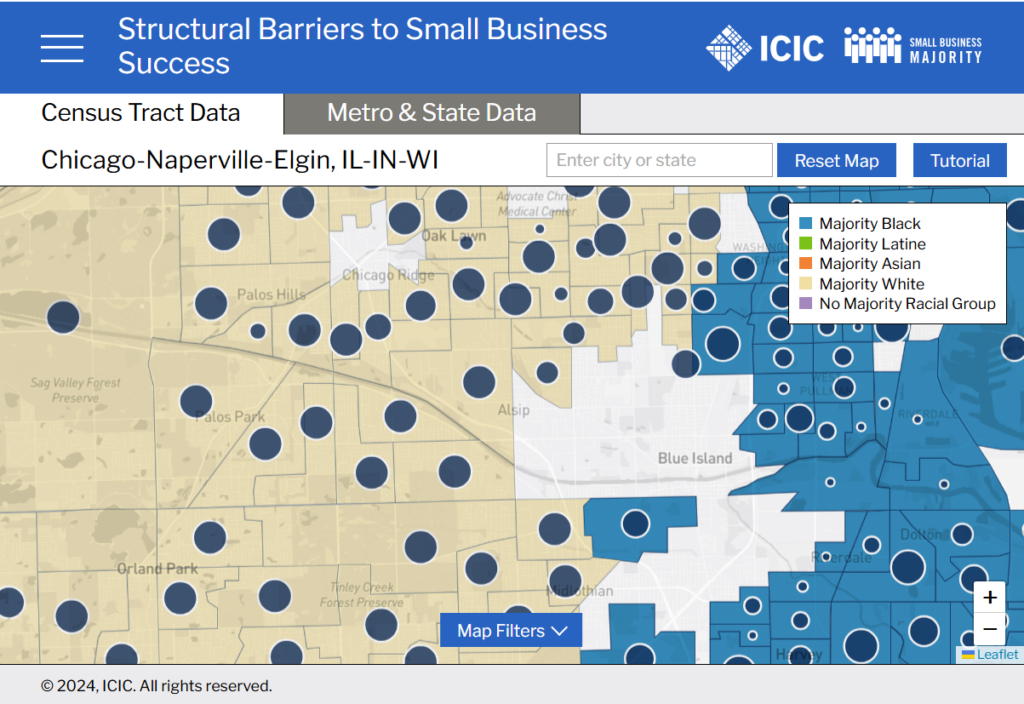
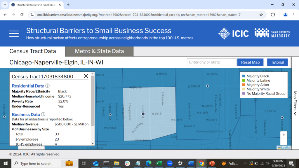
Let’s start by taking a closer look at census tract 17031834800 in Englewood, a historically Black neighborhood on the South Side of Chicago. This neighborhood is part of an under-resourced community (one with high poverty and low income). It has a poverty rate of 32.0% (greater than the 20% poverty rate usually used to designate high-poverty areas) and a median household income of $20,773 (less than a third of the national household median income, which is $75,149 according to estimates from the 2018-2022 American Community Survey) (Figure 2). In general, there are fewer businesses in Englewood and surrounding majority-Black neighborhoods than in majority-white neighborhoods such as some on the Southwest Side of Chicago. This suggests that residents of under-resourced, majority-Black neighborhoods in Chicago may have a harder time shopping locally and finding jobs that are close to home than do residents of majority-white neighborhoods. However, knowing how many businesses are located in communities of color does not tell us whether the success of businesses is related to where they are located or to who owns them. To answer these questions, we use the metro-level charts that are a feature of the tool.
Do Businesses Owned by People of Color Generate Lower Revenue?
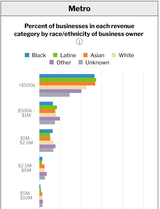
Understanding business success across racial and ethnic lines can provide important insights into economic barriers. One way to evaluate whether there are any systematic differences in the performance of businesses based on the racial and ethnic backgrounds of their owners is to compare the percent of businesses in different revenue categories for businesses whose owners are of different races or ethnicities. A racial group whose members own a higher percentage of businesses in high- revenue categories may face fewer barriers to maintaining and scaling their businesses. To look at trends in business revenue by business owner race/ethnicity in metro Chicago, we shift to the metro-level charts in the “Metro & State Data” tab in our interactive tool. In Figure 3, we see that Latine and Asian businesses are over-represented in the smallest revenue category. The figure shows that 52.1 percent of Latine-owned businesses and 52.9 percent of Asian-owned businesses are very small (less than $500,000 in revenue), according to 2023 estimates from business data provider Data Axle. This suggests that Latine-and Asian-owned businesses in Chicago may be experiencing barriers to growth in ways that businesses owned by members of other groups do not.
Do Businesses Located in Neighborhoods in Which the Majority of Residents Are People of Color Generate Lower Revenue?
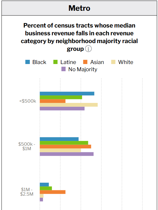
Next, let’s see whether businesses located in communities of color perform differently than those in majority-white neighborhoods, regardless of the race/ethnicity of their owners. You’ll want to know this if you’re interested in linking business outcomes to neighborhood-level factors that might affect businesses’ customer bases or supplier relationships. To do this, let’s look at an entire metro area and compare, by neighborhood majority racial group, the percentage of neighborhoods (census tracts) whose median business revenue falls into each revenue category. This allows you to quickly compare how well all businesses, regardless of the race/ethnicity of their owners, are doing relative to the racial characteristics of the neighborhood where they operate.
Applying this comparison method in metro Atlanta, Figure 4 shows that among businesses in all industries, 53.1 percent of Black majority neighborhoods, 41.2 percent of majority-Latine neighborhoods, and 25 percent of Asian neighborhoods have a median business revenue below $500,000. Interestingly, 56.4 percent of white-majority neighborhoods have business median revenue that falls below $500,000. This means that similar percentages of majority-Black and majority-white neighborhoods have very low median business revenue. That suggests that the relationship between the residential characteristics of Atlanta neighborhoods and their business communities is complex and merits further exploration.
Where Are Small Businesses Located?
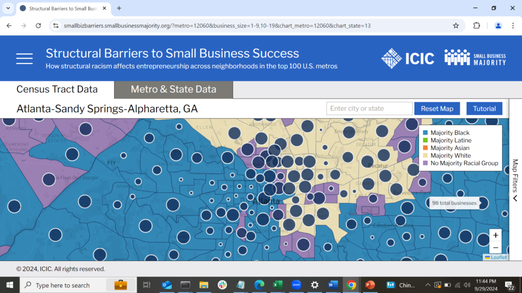
Small businesses form the backbone of many local economies. Small businesses make up a majority of the businesses in every major city in the U.S., and understanding where and how they operate is essential to support them effectively. To explore where small businesses are located, let’s shift back to the map portion of our tool, where we can explore patterns in business presence by business size (see the “Business Characteristics” section of the map filters). In metro Atlanta, small businesses with fewer than twenty employees are concentrated in downtown Atlanta and the higher-income neighborhoods in the northern part of the metro, though there are many such businesses throughout the metro area (Figure 5). Very small businesses with fewer than ten employees unsurprisingly follow a similar pattern, being concentrated in downtown Atlanta and the northern part of the metro, though with a presence throughout the metro area. This illustrates a pattern that is generally true of larger metro areas: businesses, regardless of size, tend to cluster disproportionately in big-city downtown areas and in higher-income neighborhoods.
Do Small Businesses Pay Lower Wages?
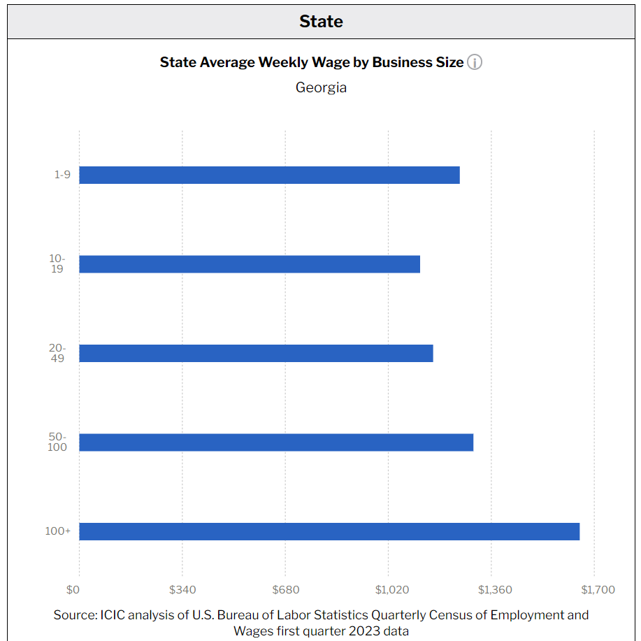
Finally, let’s explore how wages vary by business size. Despite the crucial role they play in the economies of cities, small businesses often have a difficult time attracting and retaining employees. Wages are a crucial part of this equation, because large firms often have greater capacity to offer higher pay to address hiring and retention difficulties. Our tool displays state-level average weekly wages by the size and industry of businesses, which offers users insights into whether small businesses are able to offer wages comparable to those offered by larger companies. To demonstrate this feature, we shift back to metro-level charts in the “Metro & State Data” tab. We’ll look at patterns in average weekly wage by employee size for states in the two metros we examined: Georgia (metro Atlanta) and Illinois (metro Chicago), using 2024 first quarter data from the Quarterly Census of Employment and Wages. Among all industries in Georgia, the average weekly wage for businesses with one to nine employees is $1,256 and the average weekly wage for businesses with 10 to 19 employees is $1,125. For larger businesses with 100 or more employees, the average weekly wage is $1,652 (see Figure 6).
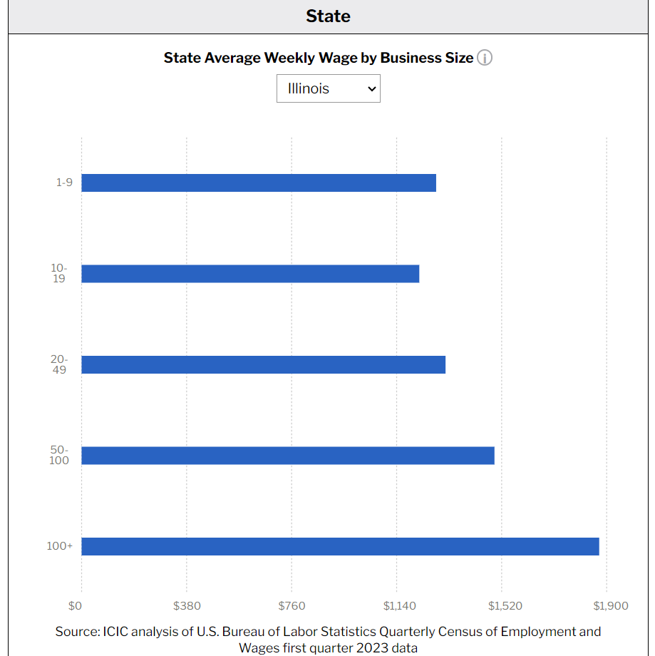
Among all industries in Illinois, we see a similar pattern, with lower average weekly wages for smaller businesses and higher average weekly wages for larger businesses. Businesses with one to nine employees have an average weekly wage of $1,283, businesses with 10 to 19 employees have an average weekly wage of $1,222, and businesses with 100 or more employees have an average weekly wage of $1,873 (see Figure 7). For these two states, small businesses pay their employees lower wages than larger businesses. Identifying the states where small businesses pay average wages that are comparable to large businesses, and using the metro-level features of our data tool to develop more detailed profiles of the business ecosystems in those places, would be an excellent start to identifying the conditions under which small businesses are best able to support a higher-paid local workforce.
Conclusion: Shining a Light on Systemic Barriers
This interactive tool illuminates challenges faced by small businesses across different communities, shedding light on systemic economic inequity. This blog post has demonstrated a few of the ways in which our data tool can help you describe the challenges that businesses in your community may face. It can also help you easily access data to highlight systemic economic inequality. We encourage local and state government officials and economic and community advocates to use our tool as an additional resource to inform their work developing and delivering programs to create a more equitable economy.
Support for this tool was provided by the Robert Wood Johnson Foundation (RWJF). The views expressed here do not necessarily reflect the views of RWJF.
